The Psychology of Paint Colors: How Shades Impact Mood
The colors we choose for our walls do more than just decorate our spaces—they have a profound impact on how we feel and behave. Paint colors can influence emotions, energy levels, and even productivity, making it essential to understand their psychological effects before selecting shades for your home. Here’s how different colors can shape the mood of your space.

1. Red: Energy and Passion
Red is a bold, attention-grabbing color that stimulates energy and excitement. It’s ideal for spaces where you want to encourage activity and social interaction, such as dining rooms or living rooms. However, too much red can feel overwhelming, so it’s best used as an accent or in combination with neutral tones.
2. Blue: Calm and Focus
Blue evokes feelings of peace, stability, and focus, making it a popular choice for bedrooms, bathrooms, and home offices. Light blues create a soothing atmosphere, while deeper shades can add a touch of sophistication. Be cautious with darker blues, as they can feel cold or somber if overused.
3. Yellow: Happiness and Optimism
Yellow is the color of sunshine and positivity. It’s perfect for kitchens, dining areas, or any room where you want to create a cheerful and welcoming environment. However, overly bright yellows can be overstimulating, so opt for softer shades if you’re aiming for a relaxed vibe.
4. Green: Balance and Harmony
Green symbolizes nature, growth, and tranquility. It’s an excellent choice for bedrooms, living rooms, or any space where you want to feel balanced and refreshed. Muted greens, such as sage or olive, are versatile and work well in both modern and traditional interiors.
5. White: Cleanliness and Simplicity
White conveys a sense of purity, simplicity, and spaciousness. It’s a classic choice for creating bright, airy environments and works as a neutral base for colorful accents. However, too much white can feel sterile or impersonal, so consider adding warmth with textures and accessories.
6. Gray: Sophistication and Neutrality
Gray is a versatile and sophisticated color that pairs well with almost any decor. It’s a neutral shade that can create a calming and elegant environment. Warmer grays with beige undertones ("greige") add a cozy feel, while cooler grays lend a modern, minimalist touch.
7. Orange: Warmth and Enthusiasm
Orange combines the energy of red and the cheerfulness of yellow. It’s a lively color that’s perfect for playrooms, exercise spaces, or areas where you want to boost energy and creativity. Softer peach tones can be used in living spaces for a more subtle effect.
8. Purple: Creativity and Luxury
Purple is associated with royalty, creativity, and introspection. Lighter shades like lavender are calming and perfect for bedrooms, while darker hues like plum or eggplant add drama and elegance to dining rooms or living areas.
9. Black: Drama and Sophistication
Black is a powerful and dramatic color that exudes sophistication. While it’s best used sparingly, black can create striking accents or add depth to a space. Pair it with lighter colors to avoid making a room feel too dark or confined.
10. Pink: Warmth and Comfort
Pink is often linked to nurturing, warmth, and comfort. Soft pinks are ideal for bedrooms or nurseries, creating a calming and inviting atmosphere. Brighter pinks can be used for a playful and energetic touch in creative spaces.
Choosing the Right Color for Your Space
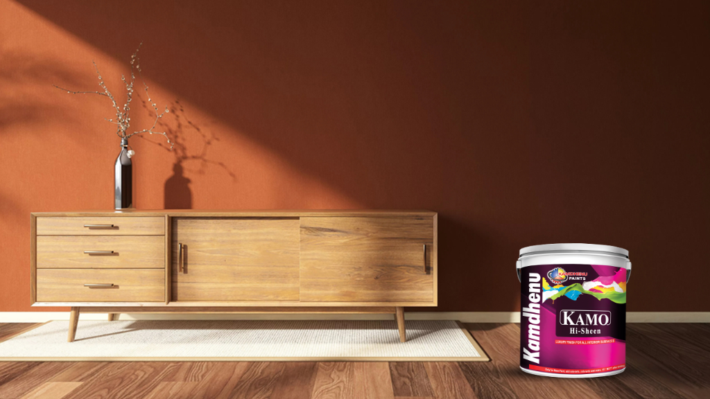
Kamdhenu’s Kamo Hi-Shine is an excellent choice, if you are looking for a smooth finishing. It is luxury premium quality interior emulsion paint with High Sheen & tough film. It is also anti-fungal and comes with an excellent washability. Kamo Hi Sheen also has excellent stain resistance making it the perfect choice for interior wall.
Interior Wall Paints | Colour for Home Interior - Kamdhenu Paints
When selecting paint colors, consider the mood you want to evoke and how it aligns with the purpose of the room. Testing samples on your walls and observing them at different times of the day can help you understand their impact. Remember that balance is key—pair bold colors with neutrals and use accents to enhance the overall design.
The psychology of paint colors is a powerful tool for transforming your home into a space that feels just right for you. Whether you want to create a calm retreat, an energizing hub, or a cozy haven, understanding how colors influence mood will guide you toward the perfect palette. Let your walls speak to your emotions and set the tone for your daily life.
Latest Blog
Loading items...